Spring 2010 Final Project
In my Graduate Studio last Fall, I worked on a group project with fellow classmate and design ex·tra·or·di·naire, TJ Blanchflower. We first worked in a group of six to research middle school science, and then paired off to design prototypes using design thinking strategies to meet North Carolina state standards. TJ and I approached the project through extreme users: even though we were working within the same system, our individual prototypes facilitated an empathic interaction differently.
Moment 01
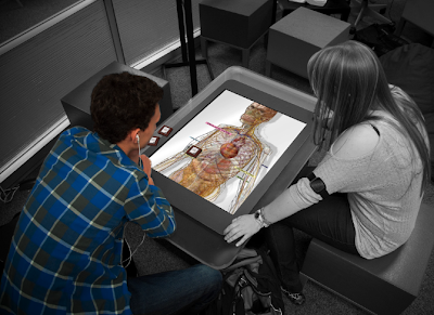
After bringing the body to a state of chronic stress through playful interactions, the participant receives an icon to use the diagnostic surface tile followed by an anthropomorphic cue; throat clearing. Once the tile is placed on the surface, the participant can move it to isolate different body systems. The participant chooses to designate the tile to control Hormones within the Nervous System.
Moment 02
As the participant lowers the heart rate, the other tiles adjust accordingly, and the body gives an anthropomorphic cue; sighing.
the grad students and their posters
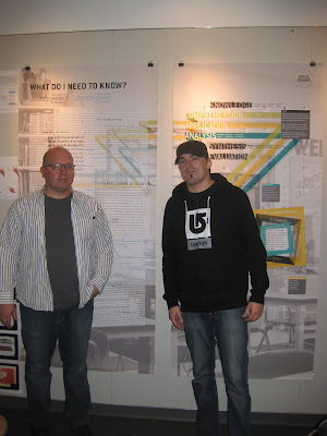
My classmates and I have collected our research on K-12 education into a series of large scale posters. We were excited to have had them hanging during the 2010 AIGA Education Conference: New Contexts, New Practices. The Science group just finished being a part of the NCSU Fishmarket "Process" Show, and is looking forward to presenting at the Museum of Natural Science: Graduate Research Show in December. Overall, we are successfully showcasing design thinking methods and research to a broad array of audiences.
Ariella Mostkoff
(Andrew & Nadya coming soon)
Gary Dickson
researchable questions (round one)
So, it is finally year two of graduate school and our class is quick to jump into the inevitable; thesis. My umbrella topics of interests are Virtual Community & Social Design, so listed below are my first round of thesis questions that I will be refining in the near future.
01. How can the design of a social networking service enhance the communication experience of members in the physical world?
02. How could the co-created technological intervention of [a specific physical community] be developed to increase member's level of engagement?
03. How could the design of collaborative tools within a social networking arena increase community facilitation?
04. What kind of methods could a designer use to co-create the conditions of a virtual community that participants could self-identify with?
05. How can the use of technology mitigate problematic internet use among [a specific group of online users]?
06. In what ways can a designer harness the ubiquity of social media to play a role in the education of [a specific young demographic]?
07. How can the visualizations of online interactions in a social networking setting shape [a specific audience's] perception of self?
08. How can the affordances of digital media be used to address the negative implications of computer mediated communication?
09. How can the design of the interactive tools within a virtual community improve the efficiency and effectiveness of computer mediated communication?
10. How can the design of a virtual community facilitate and enhance identity formation?
Having approached these queries so broadly, my goal is to give my questions more context through specificity. I know what kind of methods and skills I would like to learn during my thesis project, now it is just a matter of deciding what specific social networking service and users will be my vehicle of exploration.
end of the year wrap up
So, the end of my first year is here and our class can officially call ourselves "second years". Exciting! I have really seen myself grow a lot through this process. I love to post all of my work—because no matter how unspectacular it might be—it is great to look back and constantly see how far I've come. And let's face it, the idea is usually better than the form due to time constraints.
This is my final project for gestural interactions:
I focused on the idea of gesturecons and how the technology could be intuitive and reassuring. The scenarios use futurecasted technology, since the affordances of interactive holograms allow for different kinds of interactions than a digital space (e.g., no screen, environmental immersion).
For final review we discussed how this semester might inform thesis ideas. I found myself gravitating to the design of virtual communities and the subculture of people who seek refuge in online environments (like Second Life). There is emerging research on how online social interactions appeal to a certain kind of user (psychosocially distressed) and end up worsening their condition. The emotional implications that designed online mediated environments have on user experience has definitely got my attention. I'm excited to see where this seed of interests will take me over the summer.
Thesis, here I come.
taxonomy of ui gestures
For our last stretch of the semester we are looking at gestural interfaces in conjunction with our database. I thought about how the seven colors of health (my database) inform the way that people eat and shop, so looked in those contexts for naturally occurring gestures. These grand gestures that make up my taxonomy include: scanning an object at checkout, getting an item off the shelf, eating food with different types of cutlery, &c.
I found it challenging to try and utilize these specific gestures in an interface—even though their use in context was similar to it's use within the database—because it instantly became vaguely symbolic. The gesture used to interact with the information had to be a learned behavior that challenged existing conventions. While challenging conventions is awesome, I found it to be particularly cumbersome and exhaustive in this case. In one iteration, with a fridge interaction, my user looked like a genie in front of this appliance silently commanding recipe shopping at will. (enjoy below)
I ended up taking a slightly different route for my final project, where it became less about the gesture and it's meaning within the system, and more about the visual feedback during interaction.
And yes, this all happens in the future...haha
THIS BLOG HAS MOVED
This blog is now located at http://lroddesign.blogspot.com/.
You will be automatically redirected in 30 seconds, or you may click here.
For feed subscribers, please update your feed subscriptions to
http://lroddesign.blogspot.com/feeds/posts/default.
You will be automatically redirected in 30 seconds, or you may click here.
For feed subscribers, please update your feed subscriptions to
http://lroddesign.blogspot.com/feeds/posts/default.
interactive moments
Working with my 'color in relation to nature' database, I completed three project prompts (6 moments).
PROMPT ONE
Combine 1 motivation with 1 attribute of experience.
For this moment I assigned 'credibility' as the user's motivation and 'framing' for their attribute of experience. After critique we had an hour to story board an improved idea, so I attempted to make the interface more color centric. It was also important for me to keep pushing my visualizations of time.
PROMPT TWO
Design two moments where the user's motivation shifts according to the attribute of experience.
Again, I was looking for new ways of representing time and exploring the possibilities of user interaction. If a user has to hold onto the ball to collect the color data in one moment, how would their motivation shift if their mouse rollover resulted in a color seeking behavior?
PROMPT THREE
Retain a comparable attribute of experience throughout 3 different environments.
The distinction between "I hear you" and "I'm listening to you" is what I wanted to get across in my last three moments—except with the focus being on how we see. By mediating the vision between someone and their environment, I can encourage a different way of seeing. So, the attribute of experience is isolating color in your environment, which was carried through on an iphone, desktop computer, and hand-held spectacles or as Cadie would say, "Interface on your face!"
I was amazed at how difficult it was to reinvent the click (not that that was our implicit goal). But, if a mouse could not go up to an object on the screen, click on it, and make requested information appear...what else could it do instead? Also, since the desktop metaphor is an invented notion, just imagine how different computer experiences would be if the driving metaphor behind them defied the laws of gravity, or interpreted them literally. Both of these scenarios have me imagining a neutral mouse state either floating away or instantly slamming to the bottom of the screen.
Anyhow, I am excited about moving forward with my explorations.
spring semester 2010
The spring semester at NCSU is all about interface, so we have been hard at work! So far we have picked a database (that would enable us to explore different affordances), started a concept map, did rapid prototyping, and responded to three project prompts requiring us to explore user motivation and attributes of experience. I chose 'color in relation to nature' as my database.
Below are current screenshots of my concept map:
And my results from our rapid prototyping session:
Our professor Denise Gonzales Crisp invited the second year students to take a break from thesis and watch a screening of our prompted moments in Burns Auditorium this coming Wednesday. I'll be posting my compilation video later this week.
mediated seminar festivities
Today in Seminar, my classmates Kelly and David had a great idea for discussing our assigned reading. Relevant to the discussion of technology and it's implications, we partnered up to mediate our comments through Xtranormal (a text to movie website).
The process of converting a face to face conversation into an animated "conversation" was very eye opening. The tone of our physical conversation was primarily serious in nature, but that changed once we began directing how it would be broadcasted. In the end, the agency over the childish avatars, sound bytes, body gestures, and camera angles provoked a more playful tone in dialogue.
Watch below as Wendy and I discuss Sherry Turkle's text:
I'm fully aware that this video might seem a bit odd out of context, but nevertheless I found the implications of this exercise worth sharing.
Subscribe to:
Posts (Atom)